
Visualizing Key NFL Team Data on Win Conditions
Artificial Neural Networks and Machine Learning techniques have been used in the past to predict NFL game outcomes. Let's explore the data and find some correlations.

Artificial Neural Networks and Machine Learning techniques have been used in the past to predict NFL game outcomes.
Some of the research is from years ago at a time when AI and ML models were arguably more difficult to implement. Now we have access to larger data sets and relatively cheap cloud computing resources. The NFL keeps extensive statistics on the player and team performance by game, play by play and player by play.
I chose to focus on NFL games because of the massive popularity of the sport in the United States, the relative ease of gathering data and the extensive amount of data gathered by organizations.
Introduction
Artificial Neural Networks and Machine Learning techniques have been used in the past to predict NFL game outcomes, see [1, 2, 3], and many more with a simple Google search. Some of these papers were written years ago at a time when AI and ML models were arguably more difficult to implement. Now we have access to larger data sets and relatively cheap cloud computing resources. The NFL keeps extensive statistics on the player and team performance by game, play and play and player by play [4]. Frameworks such as TensorFlow, PyTorch, Keras and others let us quickly get started, experiment and explore data and models without getting bogged down in implementation details (that comes later).
Gathering the Data
Box score data is available from a few places, I evaluated the following:
I used a script to pull the 2017 regular season games from the NFL website which includes the team and player stats. You can download a sample game record to get an idea of what and how much data is available. I've included a snippet here:
{
  "away": {
    "abbr": "KC", // team
    "score": {
      "1": 7, // quarter and score
      ...
    },
    "stats": {
       "defense": {
        "00-0123456": {
          "ast": 4, // assists
          "ffum": 0, // fumbles
          "int": 0, // interceptions
          "name": "J.Smith", // player name
          "sk": 0, // sacks
          "tkl": 4 // tackles
        }
      },
      "fumbles": {...},
      "kicking": {...},
      "passing": {...},
      "receiving": {...},
      "rushing": {...},
      "team": {
        "pen": 15, // number of penalties
        "penyds": 139, // penalty yards
        "pt": 6, // number of punts
        "ptavg": 42, // net punting avg
        "ptyds": 262, // punting yards
        "pyds": 352, // net passing yards
        "ryds": 185, // net rushing yards
        "top": "30:14", // time of possession
        "totfd": 26, // total first downs
        "totyds": 537, // total net yards
        "trnovr": 1 // turnovers
      }
    }
  },
  "drives": {
    "1": {
      "end": {
        "qtr": 1,
        "team": "NE",
        "time": "12:08",
        "yrdln": "KC 2"
      },
      "fds": 5, // first downs
      "numplays": 13,
      "penyds": 12, // penalty yards
      "plays": {
        "118": {
          "desc": "J.White to NE 43 for 8 yards ...",
          "down": 3,
          "players": {
            "00-0023456": [
              {
                "clubcode": "KC",
                "playerName": "J.Smith",
                "sequence": 5,
                "statId": 82,
                "yards": 0
              }
            ]
          },
          "posteam": "NE",
          "qtr": 1,
          "sp": 0,
          "time": "14:14",
          "ydsnet": 73,
          "ydstogo": 2,
          "yrdln": "NE 35"
        }
      ...
    }
}
My dataset contains 256 games from the 2017 regular season. Each game record has hundreds of data points that are potentially useful in predicting the outcome of a game. To get a better understanding of the data, I'll plot some of the features against the target variable, home win.
Exploring the Data
First, I'm going to use features that have been shown to be significant in [1, 2, 3] for predicting game outcome.
- Total yardage differential
- Rushing yardage differential
- Passing yardage differential
- Time of possession differential (in seconds)
- Turnover differential
- Home or away
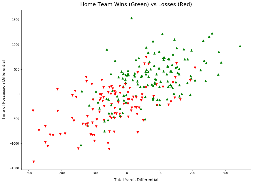
Total Yardage Differential and Time of Possession
The first plot in Figure 1 shows the relationship between home win outcome and total yardage differential and time of possession differential. Observe the trend from the bottom right corner to the top right, as the time of possession and total yardage differential increase, there is a clear trend toward a winning outcome.
import matplotlib.pyplot as plt

ax = plt.figure().gca()

for i in range(X.shape[0]):
    marker = '^' if y[i] == 1 else 'v'
    color = 'g' if y[i] == 1 else 'r'
    ax.scatter(X[i,0], X[i,2], s=50, color=color, marker=marker)

ax.set_title("Home Team Wins (Green) vs Losses (Red)")
ax.set_xlabel("Total Yards Differential")
ax.set_ylabel("Time of Possession Differential")

plt.show()
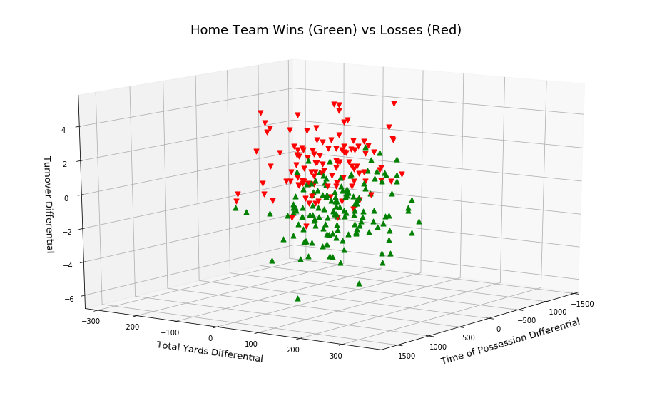
Total Yardage, Time of Possession and Turn Overs
In Figure 2, I add a 3rd feature: turn over differential. Plotting these 3 features were done in [2], observe the separation of the two win outcomes.
import matplotlib.pyplot as plt

ax = plt.figure().gca(projection='3d')

for i in range(X.shape[0]):
    marker = '^' if y[i] == 1 else 'v'
    color = 'g' if y[i] == 1 else 'r'
    ax.scatter(X[i,2], X[i,0], X[i,3], s=50, color=color, marker=marker)

ax.set_title("Home Team Wins (Green) vs Losses (Red)")
ax.set_xlabel("Time of Possession Differential")
ax.set_ylabel("Total Yards Differential")
ax.set_zlabel("Turnover Differential")

plt.show()
PCA for Visualization
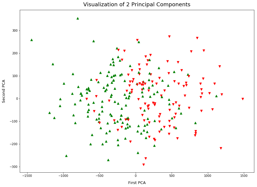
The final plot is of the first 2 principal components. Principal Component Analysis (PCA) can be used as part of preprocessing, it reduces the dimensions of the feature space in a way that maximizes variance.
PCA also very useful to visualize data, in this case, I take a 9-dimensional feature space and reduce it to 2 dimensions. This lets us plot Figure 3, observe a similar separation of data points as the above.
Which Features are Important?
When I initially looked at the data, I didn't have any prior knowledge of how to rank features as I have a very shallow knowledge of the game. During my research, I found a few techniques, in [2] PCA is used to weight the most important features in order to optimize training. I've seen the technique of using an ANN with L1 regularization on the weights to eliminate features that aren't important to the learning task, eg: setting weights exactly to zero.
In [1] I found an interesting visualization of a correlation heat map. It's a quick way to see how features correlate with each other. Plotting a correlation heat map is relatively easy. In Figure 4, I've generated one using Pearson's method. This is a measure of how well each feature pair linearly relates.
For the purpose of a richer correlation heat map, I've included more features in Figure 4:
- Total Yards Differentials
- Rushing Yards Differential
- Possession Time Differential
- Turnover Differential
- Passing Yards Differential
- Penalty Yards Differential
- Penalties Differential
- Total First Downs Differential
import pandas as pd
import seaborn as sns

df = pd.DataFrame(data, columns=[
    'Total Yards Differentials',
    'Rushing Yards Differential',
    'Possession Time Differential',
    'Turnover Differential',
    'Passing Yards Differential',
    'Penalty Yards Differential',
    'Penalties Differential',
    'Total First Downs Differential',
    'Home Win'
])

corr = df.corr(method='pearson', min_periods=1)  # or 'spearmans'

sns.heatmap(corr, xticklabels=corr.columns, yticklabels=corr.columns)

Observe in Figure 4 the following positive correlations to Home Win:
- Possession Time Differential
- Yardage Differential
- Total First Down Differential
This seems reasonable, as these features increase (w.r.t. home team), the home team is more likely to win. Note that the correlation coefficients driving the heat map colors are based on a linear fit of the features. There isn't a strong correlation but there is some, I'll take this into account when testing models later.
An obvious negative correlation is turnover differential. But interestingly no apparent correlation with penalties, perhaps because both teams receive penalties throughout the game.
Conclusion
This was a first look at the data available. I didn't explore all the features as I want to first baseline the research I've done so far. In subsequent posts, I'll explore more features that were included in [4, 5] such as travel distance, the relative strength of each team, weather and previous encounter outcomes.
More Frameworks and Tools
The data gathering and exploration were carried out in a Jupyter notebook running in FloydHub. It's a great platform that provides a managed environment (not limited to Jupyter notebooks). I was able to quickly switch my environment between a CPU and GPU backed instance. They offer data set management and versioning that is easily mounted into your session. I personally use it for all of my prototypes and quick data analysis. It frees you from all of the setup and configuration. The environment comes primed with all of the major machine learning frameworks and data tools, in less than a minute it's ready to go.
- FloydHub (Easy and accessible platform for building ML/AI models)
- NumPy (General purpose data manipulation)
- scikit-learn (Data analytics and machine learning library)
- pandas (Used to create the correlation coefficient matrix)
- seaborn (Used to generate the correlation heat map)
References
- Pablo Bosch, "Predicting the winner of NFL-games using Machine and Deep Learning.", Vrije universiteit, Amsterdam, Nederland Research Paper Business Analytics , 2018
- Joshua Kahn, "Neural Network Prediction of NFL Football Games", 2003
- Jim Warner, "Predicting Margin of Victory in NFL Games: Machine Learning vs. the Las Vegas Line", 2010
- Rory P. Bunker and Fadi Thabtah, "A machine learning framework for sport result prediction", Auckland University of Technology, Auckland, New Zealand, 2017
- Jack Blundell, "Numerical algorithms for predicting sports results", 2009